The new federal price transparency law is rolling out Jan. 1, 2021, mandating that hospitals have to list prices on their web sites.
Describing the new rules, the Centers for Medicare and Medicaid Services say on their website:
“Hospital price transparency helps Americans know the cost of a hospital item or service before receiving it. Starting January 1, 2021, each hospital operating in the United States will be required to provide clear, accessible pricing information online about the items and services they provide in two ways:
“As a comprehensive machine-readable file with all items and services.
“In a display of shoppable services in a consumer-friendly format.
“This information will make it easier for consumers to shop and compare prices across hospitals and estimate the cost of care before going to the hospital.”
So how did they do? We went looking for some of the early ones, and found this one. More to come!
Immediately, some complications
First, they’re hard to find.
This doesn’t surprise us — when the last Trump administration transparency law went into action on Jan. 1, 2019, we heard from a lot of people “Oh, transparency is here! The golden era of consumer knowledge in health care!” Our response included this post: “Hospitals now have to post price lists. Does that mean instant transparency? Uh, no.” Our early thoughts are about the same this time.
We didn’t see a machine-readable one, but we found this pdf file, which is technically machine-readable, from
Putnam Hospital Center in Rhinebeck, N.Y. See screenshots below of individual pages.
It says it’s 1,420 pages. This may be the “consumer-friendly format,” though we didn’t find it too consumer-friendly.
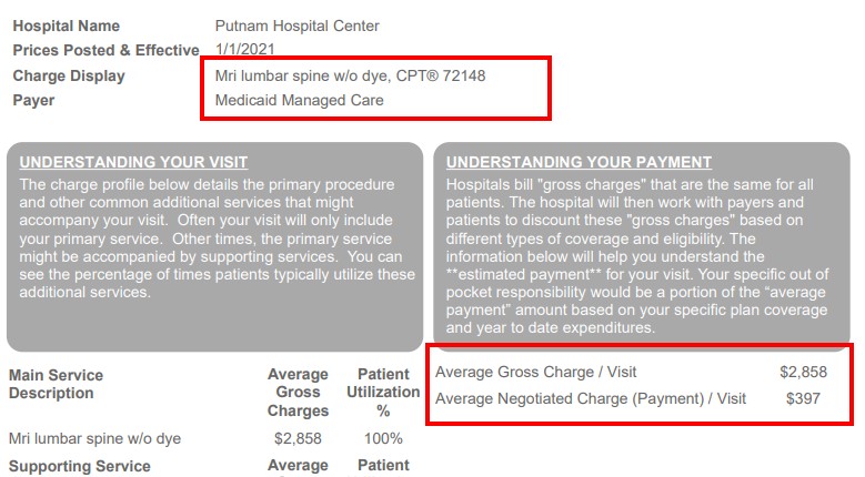
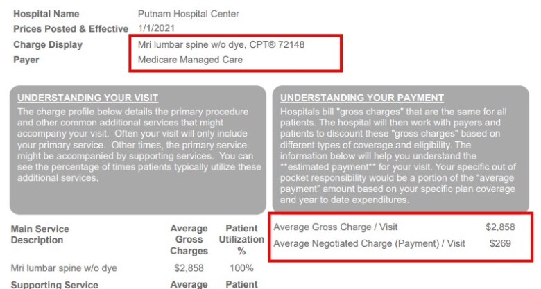
We noticed that the CPT codes identifying procedures are at the top of the page, with the name of the insurance company. Then to mid-page on the right, we can see the average charge and payment for that insurer.
We were amused to see that it’s on WordPress, the widely used blog hosting site. We know that because the url for the document is one that we see on our WordPress site all the time. Tech folks make fun of WordPress for its lack of security, though it’s widely used. FYI, here’s the URL [https://patients.healthquest.org/wp-content/uploads/2020/12/330273_Putnam-Hospital-Center_Consumer-Shoppable-002.pdf[ — the “wp-content” part is the giveaway. Happily, this WordPress functionality means that the entire document is here in this window for your viewing pleasure. If you’re not interested, scroll on by.
Related: The lists for sister hospitals are also on the parent site. Here’s Sharon Hospital. Here’s Northern Dutchess Hospital.
For this group, it seems that the Chargemaster, the gross charges list and the “consumer shoppable” list are on the same page. See an example here.
Looking further, we can see that other Nuvance Hospital sites have similar examples. Western Connecticut Health Network, parent of Danbury Hospital, New Milford Hospital and Norwalk Hospital, has a very similar set of pages. Here’s the Danbury page, as an example. Here’s the New Milford page.
You can download two files — the one resembling the one in the screenshots below — and also a Chargemaster file, which includes a huge amount of data: Gross charges, charges per insurer on an inpatient basis and an outpatient basis. We went to the New Milford page above, but got a Danbury spreadsheet.
New Milford Hospital Pricing Estimator Tool
There’s no cash price; it says “Danbury Hospital does not have an upfront discounted cash pricing policy but does work with patients to address their financial assistance needs. To obtain more information about our financial assistance programs please contact our Customer Service Dept.”
Click to access 330273_Putnam-Hospital-Center_Consumer-Shoppable-002.pdf
The hospital site says it’s now part of Nuvance Health, and we see several other price lists in their parent site. We’ll report on them in the future, but for now, a closer look at this one.
Missing data
There’s a lot of missing data, sometimes with no explanation.
Here are 11 screenshots of 11 successive pages for an MRI of the lower back, with no contrast, CPT code 72148, one of the most common MRI’s and one that we benchmark on because we’ve seen so many of them.
As always, we have little interest in charged prices — those charges are something like an MSRP for electronics, or a rack rate for a hotel. The hospital can charge what it wants; what it gets paid is a function of contracts with private insurers, or government regulations in the case of Medicare and Medicaid.
Notice the wide disparity in paid prices.
Also notice how hard it would be for you to comparison shop. So how valuable is this kind of transparency to an actual individual? Does it say anything here about co-insurance or deductible? Nope.
It would be quite difficult for the average person to first find these, and then understand them, and then figure out how to compare, insurer by insurer, who’s paying what for that MRI.
And then how is that actionable? If you have MVP insurance, maybe you know what MVP is supposed to charge — but how does that translate into an action? Are you supposed to dump Aetna, the high-priced payer and jump over to Empire mid-year to get a cheaper MRI? Of course you can’t do that, and you can’t go ask the hospital to give you the Empire price if you’re an MVP member. And what about that deductible? And co-insurance?
Finally, we didn’t see a cash or self-pay price on any of these documents. We’ll keep looking, but so far that’s not here.
Undercutting Medicare and Medicaid
Notice also how some insurers seem to be able to undercut both Medicare and Medicaid, which is often described as the lowest payer. (This hospital is in New York state, which is a relatively generous Medicaid payer, we understand.) This may be interesting for price wonks like me, but it probably doesn’t mean a lot to someone who is price-shopping an MRI. This post of ours, for example, might be more actionable.
Notice how Cigna has no number at all, with no explanation. Same with Oxford.
MVP paid $467, Aetna $1,788 and Empire Blue Cross $311 for that particular MRI. Blue Cross has undercut Medicaid managed care at $397, but the Fidelis Medicaid price is not reported, also with no explanation.
United Healthcare Medicare Managed Care (this is Medicare Advantage) is a measly $269. Medicare Managed Care (we believe this is government Medicare) is the same $269.
It’s hard to see how consumers, or patients — or, as we like to call, them, PEOPLE — can deploy this information easily and effectively. It may be of interest to MVP to know that it is undercutting Aetna, at least at this hospital, but we’re pretty sure they knew that already. And we know that for many insurers, reducing their payout for procedures is not a primary goal — because the more they pay out, the more they can charge, by telling their customers that they had to pay so much that the rates are going up next year.
The rule also said self-pay or cash prices need to be posted, but I didn’t see them here.
Also, where are the prices from stand-alone radiology centers, stand-alone breast centers and colonoscopy centers? Those prices are often much lower than hospital prices. So … what exactly does this bit of transparency accomplish?
Here are some screenshots.


Another procedure
Here’s another procedure: This is a “debridement of wounds down to and including subcutaneous tissue,” CPT code 11042. This is one of many similar codes, and is the first one listed in the Putnam list. This is not something you would shop for, to be clear; it’s someone cleaning out a wound. There are various codes from 11042 to 11047, reflecting the seriousness and the depth of the wound.
Notice the same pattern here: Wild swings in payments, missing data with no explanation. MVP pays $1,728, while MVP Medicare Managed Care is $568. Aetna is blank, with this note:
“As a result of payer terms and/or patient claim volumes, additional information could be needed in order to provide a more accurate expected payment.”
What does that even mean?
Empire Blue Cross Blue Shield pays a whopping $7,487. How does that even coexist with the $568 above? United HealthCare does not reveal what it pays.


